What makes a good SaaS promo video (and what just makes it expensive)
I've been making promo videos for about 15 years. In that time I've watched a lot of budget go into videos that didn't work, and I've watched videos made for almost nothing do the job. The gap between a good SaaS promo video and an expensive one is almost never production value. It's a handful of decisions, most of them made before anyone opens an editor.
So what follows is a craft checklist, roughly in the order the decisions come up. The point is to be able to look at your own video and point at the broken part, instead of saying something feels off.
The script says one thing
The bad promos that land in my inbox are usually bad for the same reason: someone tried to be fair to the whole product.
You have a roadmap, five features, three personas, and a partner integration that someone in sales really wants mentioned. That's ten things. All of it goes into the brief and all of it comes out the other end as a video that says nothing — forty seconds divided by ten ideas is four seconds each, and I have never managed to make anyone believe anything in four seconds.
So pick one thing. Write it as a sentence a human would say out loud. "It turns your support tickets into a searchable knowledge base without anyone writing docs." Then every other line in the script either sets that up or proves it. If it does neither, cut it.
The test: after your video, could the viewer repeat back what your product does? If the best they'd manage is "it's, like, a platform for teams," you didn't write a script, you wrote a brochure.
And read it aloud. Always. A script that scans fine on the page can fall apart in the mouth, where clauses stack up and the sentence runs out of air before the point arrives. I've cut whole sentences out of scripts just by reading them into my phone and playing it back. Lines you'd defend on the page, you delete on the second listen.
If the script is where you're stuck, here's how to structure an explainer video script that doesn't put people to sleep.
The opening earns the rest
In my experience, whatever's wrong with a promo is wrong in the first few seconds. It's also the part that gets the least attention, because it's the part that gets made first, while everyone is still excited about the logo.
Which brings me to the thing I'll die on: don't open on your logo.
A logo animation at the top of a promo is a request for patience from someone who hasn't agreed to give you any. It says wait. And most of the people you're trying to reach don't know your brand yet. That's why you're making the video. Put the logo at the end, where it reads as a signature rather than a toll booth.
Open on the problem or on the result. A state the viewer recognises, or the thing your product just did, already done. Compare:
Before: "Introducing Wavelength — the modern platform for growing product teams."
After: "You wrote the same release note four times this month."
(Wavelength isn't real, before anyone asks.) The second one has a person in it. The first one is a category with a font.
I've written a whole piece on the first 3 seconds of a SaaS promo video — it's where most of them lose the viewer.
Cut to the voice, then listen twice
Here's something I got wrong for years. I used to cut to a rhythm I liked, then drop the voiceover on top and fight with it.
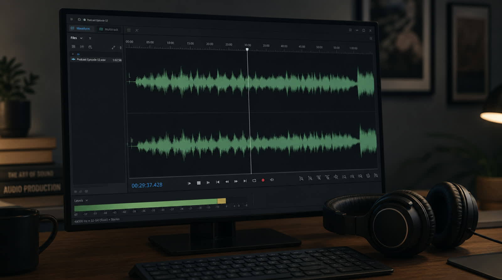
Backwards. Lock the voiceover first and cut to that. Every scene change wants to land on a phrase boundary, at the start of a new idea rather than in the middle of a clause. Don't take my word for it: move one mid-sentence cut to the end of the phrase and play both versions back to back. I can't always say what changed, but the second one stops feeling like an interruption.
Also, let a beat land. A scene needs enough time for someone to find the thing on the first watch, before they knew where it was, and then a moment more. Newer editors clip that moment off because the scene feels long in the timeline. But you've watched it until it means nothing and the viewer is watching it once. On a phone with fresh eyes it usually feels fast to me, not slow.
Captions have the same problem. A caption should hit with the word or a hair before it, never after. Late captions read as a technical fault even when nobody can say why, and you'll only catch it with the sound on. Mute review is for everything else.
Music sets a temperature and then gets out of the way. That's the whole job. Mixed too loud against the voice is the common failure: if you're straining to catch a word, it's too loud, and you're the person who already knows the words. After that, a track with a big drop the picture hasn't earned. And whooshes on every single transition, which is the audio equivalent of using six fonts.
Where sound design genuinely helps is small. One soft click when the product does the thing. A quiet confirmation when the result appears. It tells the viewer that mattered, and it costs nothing.
Then mute the whole video and watch it. If you can't follow what the product does with no sound at all, your video is a podcast with pictures. You have no idea which of your viewers had the sound on. Assume plenty didn't. Building for that loses you nothing.
Where SaaS promo videos lose people: type size
Almost every SaaS promo I get sent shows the product. Almost all of them show it too small.
Your app's UI is designed for a laptop at arm's length. Your video gets watched on a phone, in a hand, at a fraction of the size it was drawn for. That 12px label in your sidebar isn't going to survive the trip. Easy check: hold your phone at normal distance and play the video. Whatever that label looks like right now is its real size.
Vertical makes it worse, and this part is just geometry. Crop a 16:9 frame to 9:16 at the same height and you keep roughly a third of the original width. Everything comfortably legible in the wide version becomes grey mush in the tall one. Which is why "we'll just export a vertical version" isn't a plan. Vertical needs its own framing, pushed into the part that matters, with the rest thrown away.
Two rules I'd keep. First, on-screen text should be readable in a thumbnail-sized preview, so shrink the frame on your monitor until it's phone-sized in your vision and look. Second, don't ask anyone to read and listen at once. Try it on yourself: play the voiceover while reading a paragraph on screen. I lose the line every time, and I wrote it. On-screen text should be three or four words backing up the line.
Show the small true thing
There's a genre of promo where the product appears as a floating browser window doing a slow drift-zoom behind the copy. It looks expensive and it proves nothing. It's furniture. I watch those shots and come away knowing that software exists and not much else. Ask a colleague what the product did in that shot. If they can't say, it was wallpaper.
Product footage should answer a question the script just raised. Script says "you never write the doc yourself," so the screen shows the doc appearing. Cause, then effect, in the same breath.
A dashboard full of invented charts reads as stock art. One field filling in correctly, or one file landing in the right folder, reads as real, because it's specific enough that someone could go and check. And if your product genuinely doesn't look like much, which plenty of good ones don't, don't paper over it with a fantasy UI. Show the input, show the output, skip the middle.
The ten-minute self-audit
End cards go wrong in a boring way: they ask for everything (one of several mistakes I keep seeing). Website, free trial, book a demo, follow us, three social icons, a QR code. Pick the one action you actually want. One logo, one line of text, one destination, held long enough to read out loud twice. Whatever length feels right in the edit, it's short. You already know the URL.
Then run your video through this, honestly:
- Watch it on your phone, not your monitor. Everything below assumes phone.
- Mute it. Can you follow what the product does? If not, that's the fix, before anything else.
- Watch only the first five seconds. Would you keep watching if it wasn't yours? Is there a logo in there?
- Write down, from memory, the one sentence the video says. If you can't, don't expect a stranger to.
- Pause on three random frames. Can you read every word on screen at arm's length?
- Check every cut against the voiceover. Any landing mid-clause?
- Set the volume to a normal quiet-room level. Is any word of the voiceover hard to catch?
- Play it with captions and sound on. Does any caption arrive after its word?
- Count the actions on the end card. More than one, cut the rest.
- Watch the vertical version. Actually reframed, or the wide one with the sides chopped off?
Anything that fails there is a real, fixable note, and most of them cost nothing but a re-edit.
The reason I built PromoHyper is that this checklist used to require either several thousand dollars and a few weeks, or a template that ignores half of it. You paste a product URL, it reads your brand, writes and voices a script, scores it and designs every frame, in 16:9, 9:16 and 1:1, usually in minutes, from $19 — and the first one is free to render if you can live with a watermark on it while you check it against the ten items above.
The checklist works regardless of who makes the video, including you, in iMovie, on a Sunday. Expensive and good are separate axes, and I've seen plenty of work land on only one of them. Fix the opening and fix the type size and you'll be ahead of most of the promos I get sent. Neither of those costs money.