How to write an explainer video script that doesn't put people to sleep
Most of the explainer video scripts I've been handed in fifteen years open the same way. Logo. Whoosh. Then some version of "Meet Acme, the all-in-one platform for modern teams." Then a calm voice reading a feature list.
That's the moment I stop watching, and I've never had a reason to think I'm unusual. Not because I dislike the company. Because they've told me nothing I couldn't have guessed from the homepage, and they spent the only seconds I'd fight for doing it.
The fix isn't better adjectives. It's a shape. I use the same five beats for almost everything: the pain in one line, the turn, the demonstration, the proof, the ask. Boring on paper. It works.
The five beats of an explainer video script
The pain, in one line. Not the category, the Thursday night. Describe the specific bad moment your product removes, in a sentence a human could say out loud without cringing. If your opening line could be pasted onto a competitor's video without changing a word, delete it.
The turn. One sentence where the video turns to face you. Most of the scripts I get don't have a turn at all, they just cut to the product, which lands like someone interrupting. The turn is usually short and a bit blunt. "So we built the boring version."
The demonstration. Show the thing doing the thing, in the order a real user would hit it. This should eat most of your running time. In most scripts I read, it gets the least.
The proof. One reason to believe you that isn't your own opinion. A named customer, an integration, a guarantee, a number you can actually defend. If you have none of those yet, say nothing. A vague "trusted by thousands" is worse than silence, because now I'm wondering which thousands.
The ask. One action. Not three. Say it plainly and then stop talking.
First, the version that writes itself
Let's invent a product so nobody gets hurt. Call it Rota, a shift scheduling app for small restaurants. It does not exist. Here is the script it would get by default:
0:00–0:06 Introducing Rota. The all-in-one platform for modern teams.
0:06–0:16 Rota is designed from the ground up to streamline your scheduling workflow and boost productivity across your organisation.
0:16–0:27 With powerful features, an intuitive interface and world-class support, Rota helps teams of every size work smarter.
0:27–0:38 Whether you're a small business or a growing enterprise, we have a plan for you.
0:38–0:47 Join thousands of happy customers who have already made the switch.
0:47–0:55 Rota. Scheduling, simplified. Sign up today.
Nothing in that is false. Nothing in it is anything, either. Read it aloud and notice you cannot picture a single frame. "Streamline your workflow" has no picture. So I reach for a floating laptop and a gradient, because there's nothing else in the sentence to reach for, and the video becomes furniture. Pleasant, expensive, invisible.
Also count the beats. There's no pain, no demonstration and no turn. It's the ask, five times, wearing different hats.
The same product, with a spine

Same invented product, rewritten:
0:00–0:05 (no logo yet, phone screen, a group chat)
It's Thursday night and two of your servers just swapped shifts in a WhatsApp group.
0:05–0:09
You'll find out on Saturday, when one of them doesn't turn up.
0:09–0:14 (the turn, first look at the app)
Rota is a rota your staff can change, that tells you the second they do.
0:14–0:23 (screen: dragging a shift)
Drag a shift. Rota checks who's free, who's already near their hours, and who said no to Thursdays.
0:23–0:31 (split: manager's laptop, server's phone)
Your team sees it on their phone straight away. If they want to swap, you approve it with one tap. Or you don't.
0:31–0:38 (export screen)
Friday, every hour worked lands in one payroll export. Works with the till system you already have.
0:38–0:44 (logo, finally)
Rota. Free for your first two weeks, no card.
Around 44 seconds, and it's doing more than the 55-second one. Every line has a picture attached. The pain is a scene, not a category. The turn is one sentence. The demonstration gets roughly half the running time, which is roughly the split I aim for. The proof is modest and checkable, which is the only kind worth saying.
Notice what isn't there: no "powerful", no "intuitive", no "designed from the ground up". If you have to tell me it's intuitive, show me a five-second interaction instead and let me decide.
Read it aloud with a stopwatch
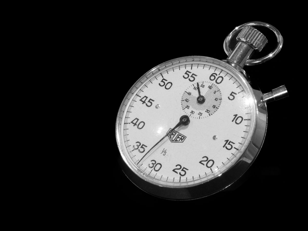
This is the part I see skipped most, and it's the part that fixes scripts.
Open your phone's stopwatch. Read the script out loud at the speed you'd use talking to a friend across a table, not the speed you read in your head. Time each beat separately, not the whole thing. Write the real seconds next to each line and compare them to the ones you guessed.
I don't trust words per minute. Count seconds.
Here's what it catches:
Sentences you stumble over twice. That's not you being bad at reading, that's the sentence being wrong. Rewrite it the way you accidentally said it on the second attempt, because that version is usually better.
Openings that are too long. Say your first line takes seven seconds on the stopwatch. That's not an opening line, that's a paragraph. I cut mine until it lands in three or four. The number matters less than noticing that seven seconds is a paragraph, not a line.
Clauses nobody can breathe through. Where you naturally take a breath is where the edit wants to cut. If a line has no breath in it, the picture has to hold for the entire line with no cut in it, and it will feel like a hostage video.
Then record it on a voice memo and listen the next morning. One night is usually enough distance for me to hear my own filler.
Every line is also a shot
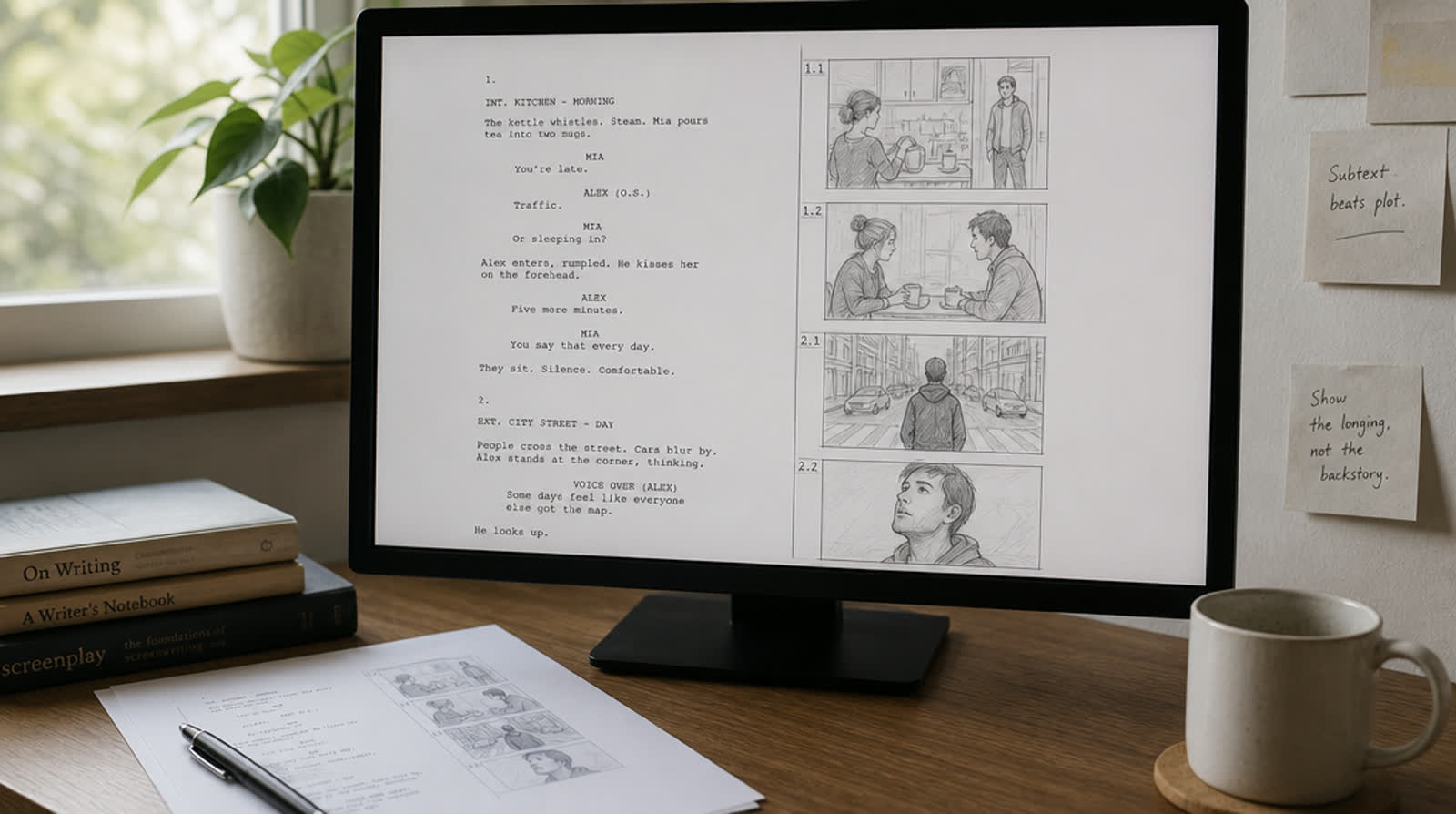
Write the script and the visuals in the same pass. One column of words, one column of what's on screen. If you can't fill the right column for a line, that line is decoration, and the animator will paper over it with motion. Motion over nothing still reads as nothing.
This ordering matters more than people think. Every time I've let design start before the script was settled, I've ended up with beautiful shots and nothing underneath them. It's why PromoHyper writes the script from your site first and only then designs the frames around it, rather than dropping your words into a template that was already built.
One more test, free and slightly humiliating: mute your own video and watch it on your phone, on the platform you're actually going to post it to. If that platform is a vertical feed, design for the narrow frame from the start instead of cropping into it afterwards. If you can't follow what the product does with the sound off, I wouldn't bet on your viewers doing better. And notice how much of the frame the platform's own interface is sitting on top of. That's where your captions can't go.
What I still get wrong
I over-write the demonstration. Every time. I want to show the settings panel, the integrations, the clever thing on the third tab, and a 45-second video becomes eighty seconds of tour. The cure is unglamorous: cut the demo to the single sequence a first-time user would touch on day one, and let the rest live on the pricing page.
I also still write "simply" and have to take it out on the second pass. I've never once seen "simply" do any work.
None of this needs a fancy tool. A stopwatch, a two-column doc and a willingness to read your own writing out loud in an empty room will get you most of the way there. If you want the script, voice, music and animation handled together, that's what I built PromoHyper for — the first video is free with a watermark on it, and from $19 without. But the shape above works whether you make it yourself or pay someone to.