Vertical video for SaaS: why cropping your 16:9 promo doesn't work
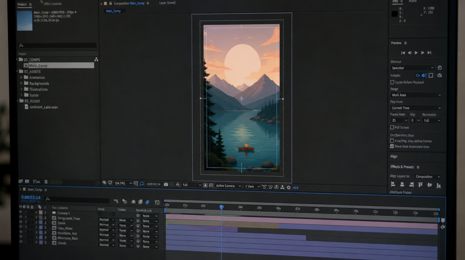
Here's the part that usually doesn't come up when you order a product video. The 16:9 file you get back is not a master that vertical video can be extracted from. It's one composition, built for one shape. Cropping it to 9:16 doesn't move it to a phone. It amputates it.
I've been making promo and product videos for about fifteen years, nearly all of it for a frame wider than it was tall.
And I've cropped plenty of landscape videos into vertical because someone needed it that afternoon. It works occasionally, and when it works it's because the video happened to be simple enough that the crop couldn't do much damage.
Let me describe what actually breaks. Just what you see on the screen.
What the crop does to your UI
Take a normal frame from a SaaS promo. A dashboard filling most of the width, maybe a caption along the bottom, a headline off to one side. That dashboard was sized to sit comfortably in a wide frame, which means the interface elements inside it (sidebar labels, column headers, the small numbers in a data table) are already smallish. Readable on a laptop. Fine.
Now crop to 9:16. You keep roughly the middle third of the width. Two things happen at once and they compound.
First, you lose the sides. Sidebar gone, right-hand chart gone, and with them whatever context made the middle make sense. You're now showing a close-up of the centre of a screenshot, which usually means a partial table or half a modal.
Second, and this is the bit that catches people out: what you don't get is detail. Cropping doesn't add pixels. You're taking about a third of the width of the master and asking it to fill a whole phone screen. Type that was borderline on a laptop comes back bigger and softer, which is not the same as more readable.
The fix people reach for is to scale up after cropping. Now you're pushing a sliver of a 1920-wide frame up to fill a 1080-wide one. The UI goes soft, and you've usually cropped harder still to hide it, so you're looking at a couple of cells of a table. You've turned a product demo into an abstract painting.
Two-column layouts die first

The frame I end up making more than any other is text on one side, product on the other. It's a good layout. It's a wide layout.
I have never found a crop of that frame that works. Centre it and you get half a sentence next to a third of a screenshot. Bias left and you lose the product. Bias right and you lose the message. The auto-reframe tools I've used pick one and pan between them, which produces that seasick drifting motion where the frame slides back and forth looking for something to hold on to. I find that worse than a bad static crop, because it advertises that something is being hidden from you.
Same problem with lower-thirds, side-by-side comparisons, before/after splits, logo walls, anything laid out in a horizontal row. A row of five logos becomes one logo and two slivers. It reads as an error.
What designing for vertical video actually means

It's a rebuild, not a re-export. The good news is that it's a rebuild with rules, and once you know them it goes fast.
One idea per frame. In a wide frame you can put a headline, a product shot and a supporting detail on screen at once and let the eye choose. In vertical you can't. So you separate them in time: headline first, then the product doing the thing, then the detail that backs it up. In my experience the vertical cut ends up with more shots than the landscape cut.
Type gets much bigger, and there's less of it. Whatever you thought was your minimum readable size, go up. Then cut the word count, because bigger type in a narrower frame means fewer words fit before you're stacking lines. A headline that sits on one line in 16:9 will wrap in 9:16, often badly. Write it shorter rather than shrinking it back down.
Show a slice of the product, deliberately. You can't show a whole dashboard in a vertical frame and expect anyone to read it. So don't. Pick the one element that carries the point: the number that changes, the row that appears, the button someone clicks, the toast that confirms it worked. Frame that. Crop the product yourself, in the layout, as a design decision, at a scale where the text is legible. That's a completely different act from cropping the finished video, because you choose what survives.
Stack, don't flank. Your two-column frame becomes a stack: product above, text below, or the reverse. Give each one real space. Resist squeezing both in to fit, or you'll end up with two things that are each too small.
Give motion the long axis. Horizontal movement in a tall frame runs out of room immediately. Something enters from the left and it's already gone. Vertical space is what you've got, so use it: elements rising in, lists building downward, a scroll that carries the eye down the frame. Reveals that travel with the shape of the frame simply have more room to run.
Assume the sound is off, and assume the top and bottom are contested. Captions aren't optional in vertical. And every platform puts its own interface over your video: usernames, buttons, progress bars, the caption you typed into the upload box. I don't have a magic number for you. Keep the important stuff away from the very top and very bottom, and check the result inside the actual app before you publish. Every platform's furniture is different, and it changes.
Where vertical earns its keep, and where it doesn't
Not everything needs a vertical version.
It earns its keep in feeds, anywhere someone is scrolling with the phone in one hand and a thumb ready. Paid social, short-form organic, in-app announcements, anywhere the video has to win attention it hasn't been granted yet.
It's the wrong shape for your website hero, for the top of a desktop landing page, for the demo you email to a prospect who'll open it on a work laptop, for a conference screen, for a standard widescreen YouTube upload (Shorts obviously excepted). A vertical video dropped into a wide space gets bars down both sides and looks like an accident.
So the honest answer for most SaaS companies is that you need both, and the vertical one has to be built as its own cut. That's the part that used to make this expensive. Two layouts, two edits, priced like the two projects they are. That's how this kind of work runs into thousands.
It's the specific problem I built PromoHyper around: it designs 9:16 natively rather than cropping. You give it a product URL and it writes, voices, scores and hand-designs the promo, and it outputs 16:9, 9:16 and 1:1. That's one video at one price rather than a second project — from $19, usually done in minutes.
The phone-in-your-hand test

Before you publish any vertical cut, do this. Put it on your actual phone. Hold it where you normally hold it, not up close. Mute it. Watch it once.
If you can't read the product UI, your type is too small or your crop is too wide. If you can't tell what the product does with the sound off, your captions aren't doing enough — though nine times out of ten it's the script underneath them, not the captions. If you find yourself squinting at any point, that's the first place I'd assume I'm losing people, so go fix that shot before you fix anything else.
I got this wrong for years. I treated vertical as a delivery format, something you handled at the end in the export dialog, when it's really a design brief. Rebuild it and it'll look like you meant it.