What founders get wrong in product demo videos
I've been making promo and product videos for about fifteen years. For most of that time, founders have sent me a screen recording and asked, in various words, whether I can just tidy it up.
The recording is rarely the problem. The problem is that nobody decided what the product demo video was supposed to argue before hitting record. And an argument has to be edited, not toured.
Here's what I see go wrong, over and over.
Direct the recording instead of narrating it
The usual process: open the app, hit record, click around while talking, stop, upload. The picture follows the mouse, the voice follows the picture, and nobody is leading.
Write the words first. The actual sentences you want a stranger to hear. Then record the screen to match them.
When you work in that order you start cutting on the voiceover. A sentence ends, you cut to the next state of the UI, and the picture arrives at the same moment the idea does. That rhythm is, to my ear, the biggest single difference between an edited video and a Zoom recording with music on it.
Record your screen actions slower than feels natural. Not slow motion. Deliberate. Move the cursor, pause, then click. I read a darting cursor as nervous even when the narration is calm. You can always speed a clip up in the edit. You cannot un-jitter one.
One path through the product, not all of it

Founders want to show everything because everything took effort. I get it. I've built things too.
But a demo that touches nine features gives a viewer nine shallow impressions, and those add up to not much. A demo that follows one job from start to finish gives them a picture of themselves using it.
Pick the path that made someone say "oh, nice" the first time you showed it live. Start at the moment before. End at the moment after. Cut the rest.
If you genuinely have three audiences who need three different things, make three videos. In my experience three ninety-second videos do more work than one four-minute video, and they're easier to place on the right landing page.
You didn't burn in captions
Autoplay in a social feed is muted by default. I don't know what share of your viewers have sound on, and neither do you. Assume a lot of them don't.
So burn in captions. Not the auto-generated ones you accepted without reading.
Two craft notes.
Timing. I set mine to land on the word or a hair before it, never after. Most captioning tools handle this fine on their own, so this is a check rather than a warning: step through one line frame by frame and make sure the text is not arriving after the spoken word. If it is, slide it a few frames earlier.
Chunking. Break lines where you'd take a breath, not where the box runs out of room. "The part everyone hates / is the setup" reads fine. "The part everyone hates is / the setup" makes me stumble. Read your caption breaks out loud once and you'll hear the bad ones.
While you're at it, watch the whole thing muted, start to finish. If you can't follow it, don't assume a stranger with lower stakes will.
Your product demo video is four minutes long
Nobody asked for four minutes.
Long demos usually aren't long because there's a lot to say. They're long because nothing got cut. A pause before the login. A "so, as you can see." A page load that should have been a jump cut. Dead air at the end because the recording stopped after the talking did.
Try this pass. Watch it with your finger on the spacebar and mark every moment your attention slips. Not where it's bad. Where it dips. Then cut all of them. There is almost always more dead time in there than you think, and I have never once cut it and then missed an idea.
Then there's the plumbing. Somewhere in the middle of most demos we end up in settings, admiring a dropdown of timezone options. Settings feel like proof of flexibility when you're the one who built them. To someone deciding whether to book a call, they're admin. Same story with empty states, onboarding wizards, the billing screen, and any modal that asks if you're sure.
The reframe that helps me: every shot has to earn its seconds by moving the argument forward. Not "is this true about my product," of course it is, but "does this shot make the next shot land harder."
One more thing, about the front of it. In my experience, when a demo loses people it happens in the opening seconds rather than somewhere in the middle. Which is why I'd tell you not to open with a logo animation, and why I feel a bit hypocritical saying it: I opened videos with logo animations for years, because it was the piece clients were proudest of paying for and because I liked making them. A logo at the top announces that an ad is starting and gives a scrolling viewer a clean place to leave. That's my read, not a measurement. Open on the product doing the interesting thing, and put the logo at the end.
The voiceover is your feature list, read aloud
You can hear this one instantly, because it sounds like a list. "PlaceholderApp lets you track projects, assign tasks, view reports and export to CSV."
I've never heard anyone say a sentence like that out loud.
Same idea, written for the ear, for a made-up product:
"Friday afternoon. Your client asks where the project stands. You used to spend twenty minutes assembling that answer. Now you send a link."
Same feature underneath. The second one gives the listener somewhere to stand.
Write your script, then read it aloud standing up before you record anything. Everywhere you stumble, the sentence is wrong, not your reading. Rewrite it the way you accidentally said it. That's usually the better line.
And give it somewhere to go at the end. Not a hard-sell card. One action, said in the voiceover and shown on screen at the same time, held long enough to read. One, not "book a demo or sign up or follow us." Say it as well as show it: the muted viewers read it, the background-tab viewers hear it, and you don't get to choose which ones you have.
The vertical version is not a crop
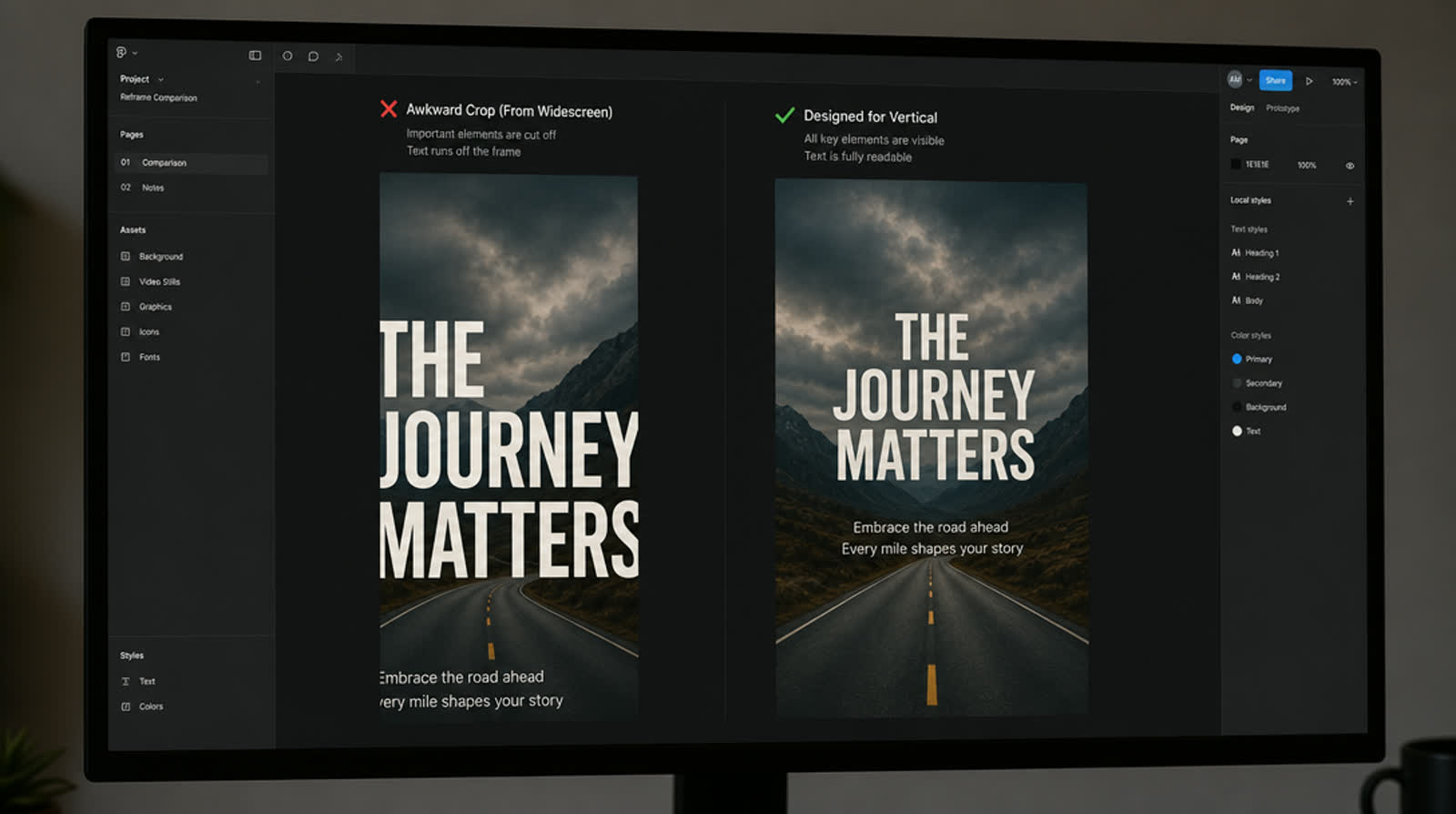
You made a nice 16:9 demo. Now you need 9:16 for a feed.
Two bad options. Fit the whole wide frame inside a vertical one and the UI text ends up a fraction of the size it was, unreadable on a phone at arm's length. Or crop in and blow it up, and the text is big but soft, because you're enlarging pixels that were never there. Neither is fixable with a sharper export. Export both and open them on your phone, held where you'd normally hold it.
What works is reframing rather than cropping. For each beat, pick the one region of the screen that matters, scale it to fill the vertical frame, and let the rest go. You're deciding what the viewer looks at, which is the job. It's more work. It's also the difference between a vertical cut and a wide video with grey bars.
That's a chunk of why I built PromoHyper. You give it your product URL and it writes the script, voices it, scores it, and designs every frame as an animated promo rather than a template with your logo dropped in. You get 16:9, 9:16 and 1:1, usually in minutes, from $19 — or free for the first one, if a watermark across it is a fair trade for seeing what comes out. Work at this level usually runs into the thousands, and usually takes weeks of back-and-forth.
None of this needs software, though. If you only do one thing from this list, do the muted watch-through, and be honest about the moment your attention wanders. I can't prove that's where your viewers leave. But it's the first place I'd cut, and it costs you nothing to find out.
There's a whole post on why cropping 16:9 to vertical fails if you're posting to Reels or TikTok.