Making a SaaS promo video in Canva: what works, what quietly doesn't, and when to use something else
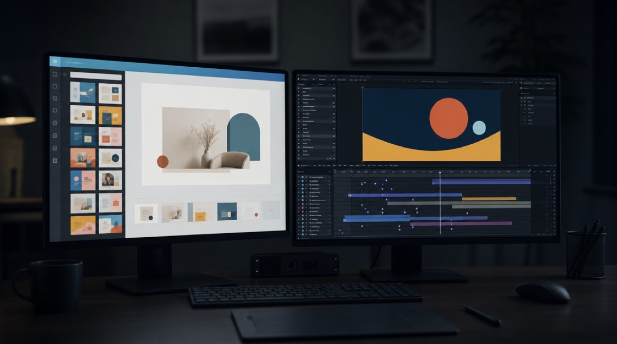
Most solo founders making their first product video open Canva, and that is a reasonable decision. It is free, it is already open in another tab, the templates look competent, and the alternative appears to be learning After Effects. I would probably do the same in your position.
I have spent fifteen years as a motion designer, including on promo work for Microsoft, xAI and Cloudflare, and a much longer tail of startups counting every dollar. I also build an AI tool that makes SaaS promo videos, so you should read what follows knowing I am not neutral. I have tried to write the version I would want to read: specific about where Canva is genuinely the right answer, and specific about the exact points where it stops being one — not because it is bad software, but because a SaaS promo asks for something it was not built to do.
What Canva is actually excellent at
Let me be concrete rather than polite.
Canva is very good at composition on a static canvas. Social posts, carousels, feature graphics, a title card, an OG image, a pitch slide. The template library is genuinely well designed, the type pairings are sensible, and it removes the blank-page problem, which is the real reason most founders never make anything.
It is also good at light video assembly. If you have a screen recording and you want to trim it, put a caption on it, add a music bed and export it, Canva does that quickly and the result is fine. Not compromised-fine — actually fine. A trimmed screen recording with clear captions is an honest, effective format, and it beats a bad animated video every time.
And it is good at iteration you control. You will rewrite your headline six times. In Canva that takes seconds, with no round trip to anyone.
If your video's job is "show the thing working, with words on top," Canva is the correct tool and you should stop reading here and go use it. What follows is about a different job.
The four places it quietly breaks for SaaS promos
These are not opinions about taste. They are structural, and they show up in the same order every time.
1. Your interface is the subject, and Canva sees a rectangle
This is the big one, and it is worth understanding properly because it explains most of the others.
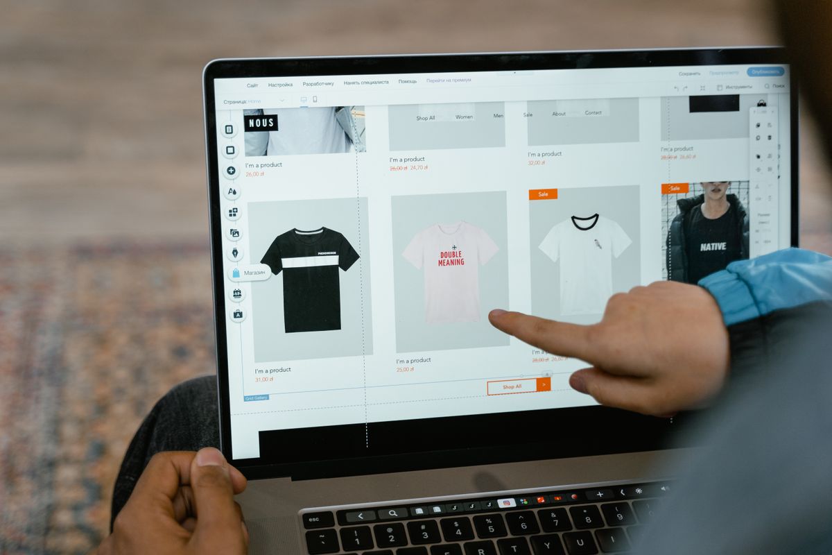
In Canva, a screenshot of your app is an image. You can slide it, scale it, fade it, put a device frame around it, maybe pan across it. Those are the verbs available for a rectangle.
But what makes software look good in video is not the screenshot moving. It is the interface behaving: a sidebar arriving before the content it contains, table rows cascading in the order a person would read them, a value counting up in a dashboard card, a panel settling into place with the weight of a real object. That reads as designed because it respects the structure of the thing being shown. A screenshot sliding across the frame reads as a slideshow, and viewers clock the difference in about two seconds even when they cannot name it.
To animate an interface that way, the tool has to know your interface has parts. Canva has no concept of that, and no reasonable amount of manual work inside Canva gets you there — you would be cutting your screenshot into fifteen images and animating each one, which is both miserable and worse than doing it properly elsewhere.
2. Templates are brand-agnostic on purpose, and your brand is the point
A good Canva template looks good with anyone's content. That is the design goal, and it is why the library is useful.
But it means your brand gets applied as a paint job. You swap the colours to your hex codes, change the font if yours is available, and the underlying motion — the pacing, the transitions, the shape language, the way things enter and leave — belongs to the template.
That matters more than it sounds. A brand like Linear, with its near-black canvas and single indigo accent and tight geometric type, actively rejects a template full of gradients and soft bouncy easing. A playful brand rejects a corporate slide-up. When the motion contradicts the brand, the video feels borrowed, and "feels borrowed" is the precise impression you cannot afford on a launch day when you are trying to look like a real company.
3. Everyone can recognise the presets
Canva's text animation presets are used by an enormous number of people. Your audience for a SaaS promo — other founders, early adopters, occasionally an investor — is exactly the audience most likely to have seen those presets a hundred times this month.
I want to be fair here: nobody watches your video and thinks "ah, preset number four." What happens is subtler and worse. They form an impression of how much care went into the product from how much care went into the video, and the answer arrives before they have consciously evaluated anything. Familiar motion reads as default, and default reads as this was made quickly.
4. Three aspect ratios means three compositions, not one resize
You will need 16:9 for your site and YouTube, 9:16 for stories and TikTok, and usually 1:1 for feeds. Canva's resize will re-flow your design into the new frame, and on a static graphic that mostly works.
On video it usually does not, because composition in motion is about hierarchy over time — what the eye is looking at in each beat. Squeeze a horizontal composition into a vertical frame and the beat that worked because two things sat side by side now has them stacked, so the relationship you were showing is gone. In practice founders resize, look at it, and either rebuild it or ship something that is visibly a squashed version of the real one.
The cost nobody counts

Canva's price is not the interesting number. Your evening is.
A first SaaS promo in Canva, done properly rather than abandoned, is realistically four to eight hours: finding a template that nearly works, replacing every element, writing and rewriting the script inside the editor, hunting for music that is cleared on your plan, recording or generating a voiceover, syncing it, then doing a meaningful chunk of it again for the vertical cut.
That is not a criticism of Canva — that is what making a video takes. But it is the number to compare against, not the subscription price. If those hours are the ones you would otherwise spend talking to users or shipping, the comparison is not "free versus paid." It is "free versus the thing I did not build this week."
So which should you use
Here is the honest split, and it does not always favour me.
Use Canva when your video is a trimmed screen recording with captions; when you need social graphics, thumbnails and title cards, which is most weeks; when you want to iterate on wording yourself, repeatedly, with nobody in the loop; when you enjoy this part and want to learn it; or when your product is visually simple enough that showing the screen plainly is genuinely the best pitch.
Use a motion designer when the video carries real weight — a funding announcement, a category-defining launch, a homepage hero that will sit there for two years. A good freelancer runs from about $1,500, an agency several times that, and for a video that has to be right, that is not expensive.
Use something like PromoHyper when you want your interface animated as an interface rather than slid around as a picture, in your own brand's colours, type and tone rather than a template's, in all three aspect ratios composed rather than resized — and you want it in minutes rather than an evening. You paste your URL, it reads your site to work out what you actually do and what your brand looks like, writes three scripts taking three different angles, and shows you the storyboard before you pay anything. It costs from $29, one payment, no subscription — and your first video is free to render, with a watermark on it, if you would rather judge the output than the description.
I would rather tell you plainly where it does not fit: if your product is pre-launch and the positioning is still moving weekly, no video tool solves that — the script will keep being wrong because the answer keeps changing. And if you have already made something in Canva that you are happy with, it is doing its job, and swapping it for a nicer video is not the highest-value thing on your list this week.
The part that is true regardless of tool
Whatever you use, the same handful of decisions determine whether the result works, and none of them are features.
Say what the product is inside the first three seconds, in words a stranger understands without context. Show one idea per beat and let the frame settle between beats — constant ambient drifting is the most common tell of automated video, and holding still is a decision. Keep it to thirty seconds unless you have a specific reason not to. Make sure it reads with the sound off, because most of the time it will be watched that way. And put your product's actual interface on screen, not an abstract illustration of software.
Get those right in Canva and you will beat a beautifully animated video that gets them wrong. That is not a consolation prize — it is the actual hierarchy.
If you want to see the difference in practice, the examples post breaks down four videos frame by frame, including one made by pointing our own tool at our own homepage. And if you are earlier than that — still working out what your video should even say — the free promo script generator gives you three different angles from your URL, with no account.